We’re very excited to share a new Android update we’ve just released in the
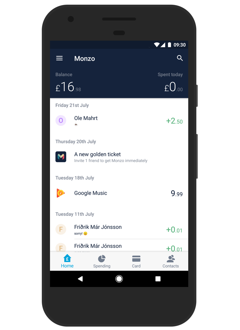
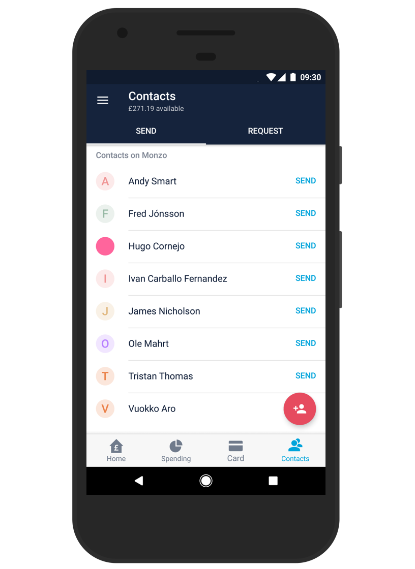
({{ site.adjust_play_store_link }}) — version 1.9.0, which includes a dramatic change to the app’s navigation. For too long Spending has been tucked away in the navigation drawer, with the options to send and request money hidden in the floating action button (FAB — the big red button in the bottom right of your app). These features are a huge part of the Monzo experience and deserve to be front and centre - so now they are!Instantly access Spending, Card and Contacts in one tap via the bottom navigation bar!

You can Send and Request money from the new Contacts tab:

And you can top up quickly from the Card screen's FAB.
The bottom navigation bar was designed following Google’s Material design guidelines and lays the groundwork for many of the upcoming current account features (like sending Faster Payments and viewing Direct Debits). You can still reach us through in app chat in the notification drawer on the left, as well as Settings, frequently asked questions and our Community Forum
This release also includes some other changes too: we can now automatically verify your phone number during signup (if you grant the app the SMS permissions) to save you doing it manually, the feed and search have received significant performance enhancements to make them smooth and snappy even with lots of transactions, and we’ve thrown in some general bug fixes reported by our always supportive community.
Let us know what you think of the new navigation changes in the Community Forum! And of course, if you like it, we always appreciate a review in the
({{ site.adjust_play_store_link }}) 😉