From the first .sketch file we created at Monzo, we’ve taken care to organise our design files very neatly. And as we’ve grown from a single designer to a team of 13, maintaining a sensible design environment has really paid off. It’s been helping us collaborate easily and stay organised, even as we’ve grown.
But using a rigid system can slow things down and mean there’s more room for human error. So we’ve built our own tool to automate our organisation, and make following the rules easier and faster.
For growing design teams at other fast-moving companies, we’ve explained the way our system works and made our tooling open source so you can use it too!
Sketch is super flexible, which comes with pros and cons
We’ve always used Sketch as our primary interface design tool, and believe it solves our biggest needs better than any option on the market.
Sketch is powerful, flexible, and extensible – the wide range of plugins available give us the freedom to structure and scale our work in lots of different ways, with almost unlimited functionality.
But because Sketch is so flexible, it means every designer has a different way of using it. That might be fine when you’re a team of one, but when multiple designers are all working in a slightly different way, there’s much more potential for trouble.
Imagine a kitchen where multiple chefs are all using the same ingredients and equipment. It’s crucial to keep things in the right place and label them correctly, so everyone knows where to find what they need.
How our system works
We use a system that makes it easy for us to find what we need quickly, and for other people to navigate our files too.
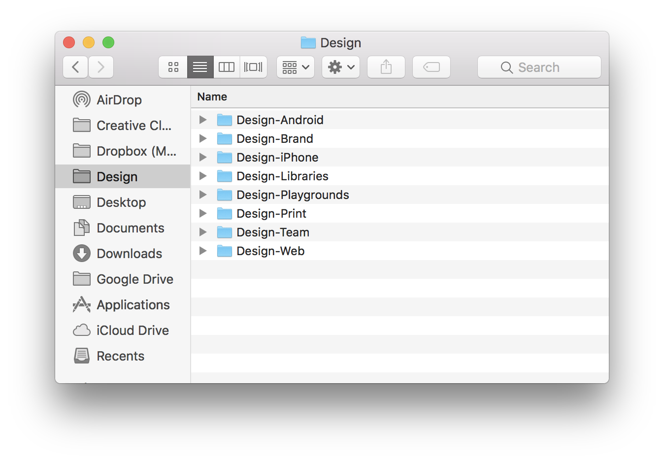
Each of these folders is a repository on GitHub, which we use for our syncing and versioning. At the top level, we have folders that contain the various platforms (like Android or iPhone) and mediums (like print or web) that we work in.
It looks like this:

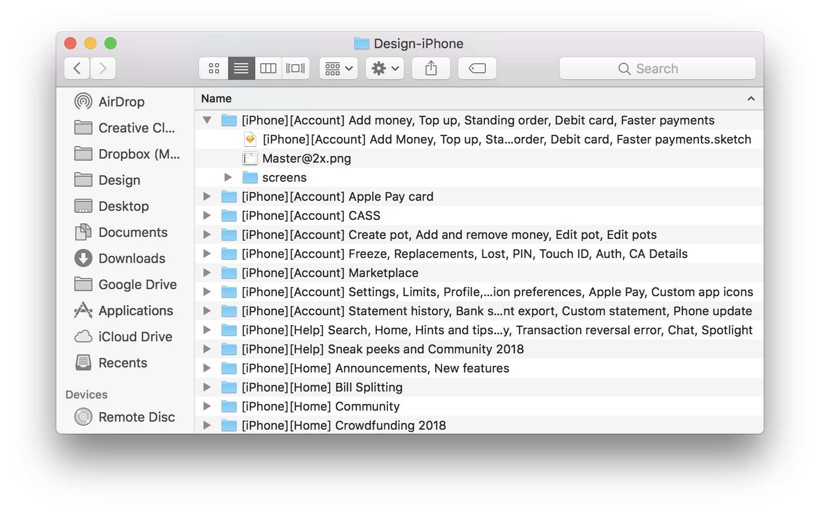
Inside, they look like this:

We use clear, descriptive names that refer to the part of the app and the flows it contains.

This means we can find our files easily using Spotlight, and engineers and product managers can discover them through Github’s search.
For example, if I want to find the flow for editing a Pot on iPhone, I can search in Spotlight for:
“edit Pot iPhone sketch”
“Pot iPhone”
“Pots sketch iPhone”
(you get the picture)
I don’t have to guess what a project’s called or track down where it lives.
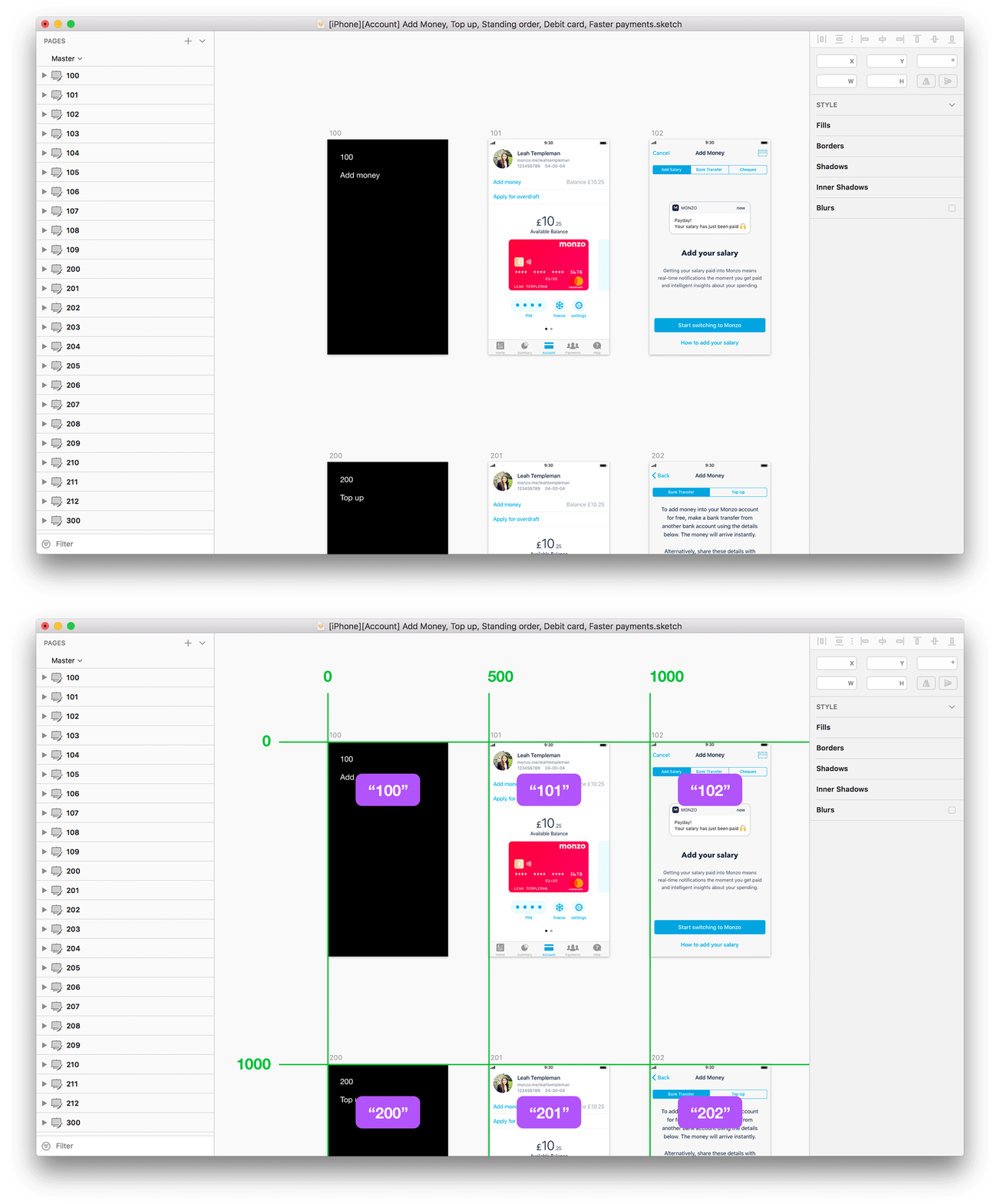
In the Sketch file, we keep all the artboards on a single page, called Master. This means that everything in the file is visible at the surface level – you can see everything as soon as you open the file, rather than digging through several pages to find what you need.
Inside each file, you’ll see the artboards follow a rigid grid structure. Every artboard in Sketch has a coordinate that indicates its location on the page. We make sure that the first artboard on any file begins at 0,0. We put each new flow on a different row, and begin each new flow with an introductory screen that describes the flow that follows.
Horizontally, the artboards sit on 500px increments, so their coordinates are 0, 500, 1000, 1500 etc. Vertically, they sit on on 1000px increments, so their coordinates are 0, 1000, 2000, 3000 etc.

We don’t use descriptive names for our artboards, we number them instead. The content of each artboard can be so specific that trying to describe it can be tricky. So using numbers to name our artboards helps us avoid subjective, vague or inaccurate descriptions that would make things inconsistent and harder to navigate.
Using numbers also means that when we export the artboards, we automatically save them in the correct order. If we used descriptive names, exporting them would save them in alphabetical order, which wouldn’t reflect the flows correctly.
Lastly, using numbers syncs very nicely with the way screens are ordered in Marvel (the tool we use for sharing prototypes). This makes it really easy to drop a full flow into a prototype and share it with other people.
But maintaining a strict system involves lots of manual work
This has been very successful for keeping our files clean as they’ve scaled. But there are also some downsides to following such a strict system.
Having such rigid rules requires constant maintenance to make sure we meet them.
You have to move screens manually to align to the grid
You have to rename artboards manually
If you insert screens in the middle of a flow, everything that follows needs renaming
When one artboard is longer than the others, all need to move
You have to ensure the flow names are accurate
Being constantly vigilant can be painful. And fixing our files is fiddly, time-consuming, prone to error and ultimately blocks us from actually designing!
So we’ve built tools to automate our organising
To help us keep our files clean and avoid lots of manual work, we’ve built File Cleaner – a Sketch plugin that keeps our files immaculately clean and in order. And we’ve made it open source so you can use it too!
If you hit ctrl+shift+L, File Cleaner will:
Check that you’ve named all the pages and artboards correctly
Check there’s no duplicate artboards
Align all the screens to the grid
Place new screens in the right place in their flow
Re-order the left panel so artboards are in their correct place
Let’s try it out
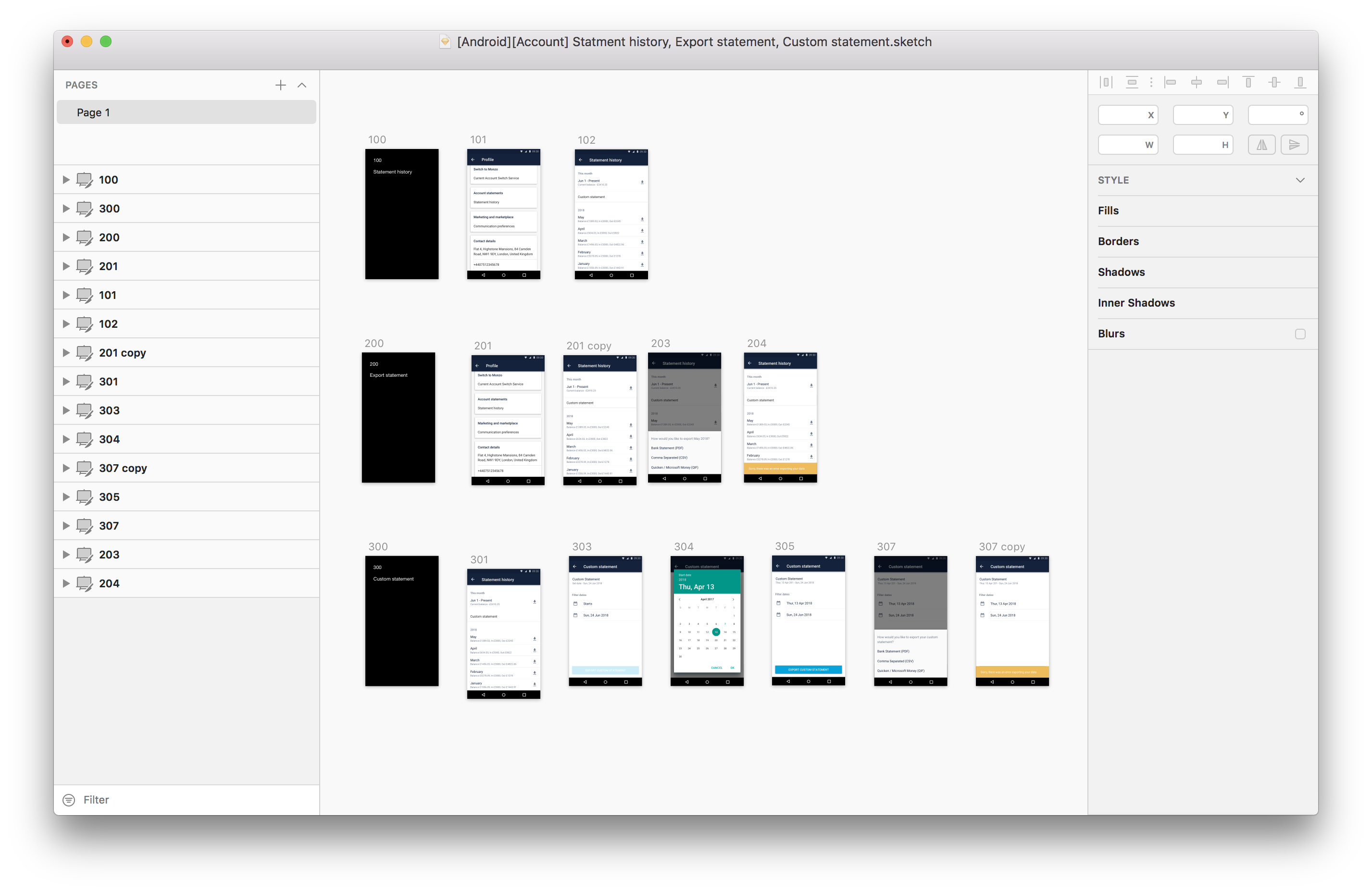
As an example, we’re going to try it out on our bank statement file. I’ve been working on several changes, adding some new screens and updating current ones. I’ve worked quickly and haven’t taken much care to follow the rules too closely.
The file looks like this:

It follows the correct structure, but it’s a bit messy. The artboards aren’t aligned and their names are wrong.
When we run File Cleaner, it starts by pointing out any mistakes that break our naming pattern, so I know what I need to fix.
Once that’s done, I can re-run the plugin and everything will snap into place. Here’s how that looks in practice:
The real magic happens when you start adding and removing artboards from your page. File Cleaner will know where your new artboards need to sit, and adjust all your existing artboards to fit around them:
File Cleaner lets us quickly clean up files, and means that adding new things and moving pieces around is no longer a painful process.
And you can use it today!
We’ve made File Cleaner available to everyone, so you can start using it as part of your workflow today. We’ve outlined what it can do, how to use it, and given more examples in GitHub. And because it’s open source, you can tweak it yourself so it works for your needs.
We’ve shared our system because we’re committed to transparency, and we want to help other teams learn the lessons we’ve learnt, save time and stay organised.
We’ve made our tools open source because we want design teams to be able to use these rules in a way that’s practical, even if you don’t have the engineering bandwidth to build tools yourself.
What excites us most is that this is just the first, small step for our design tooling. We now have a team dedicated to building tools to improve designers’ workflows, and we’ll be making everything we build public so you can use them too!